This project was made for a 2nd year module called Industry Portfolio Development. We were allowed to make any “artifact” that fit our study area. Mine being Game Design I thought I would pick something in User Interface Design as I really enjoy UI Design.
When we started it took me a while to figure out what I wanted to do as I didnt have any ideas for a new project. However recently I had been replaying The Sims Bustin Out on GBA and thought I could use that as a base. I decided to go forward with redesigning some of the major UI elements of the GBA game to fit with current Sims games and make it better for a bigger display.
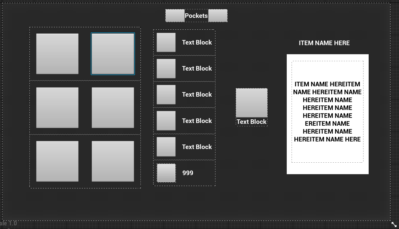
As I always do I first started out by mocking up some designs in Adobe Xd as for me its easier to quickly throw out multiple concepts for UI design stuff. As well as keeping things organized. See some of the art boards below.
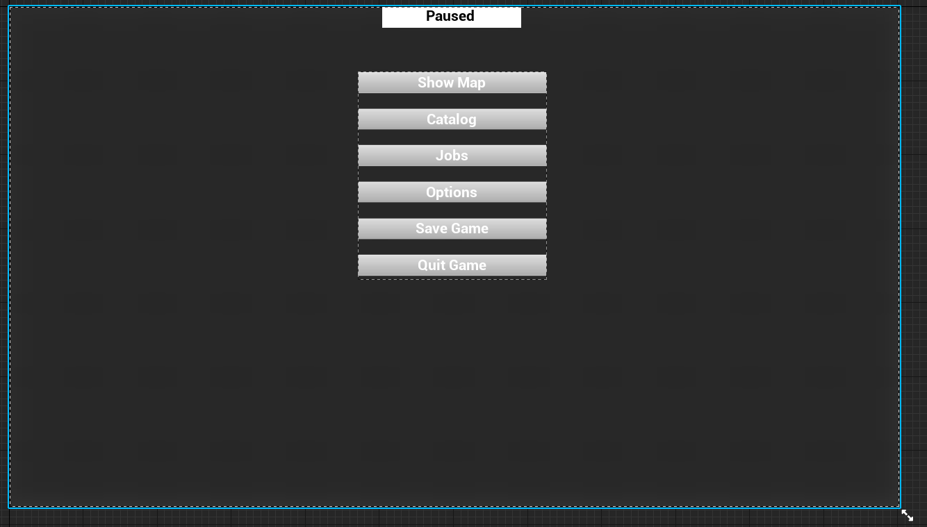
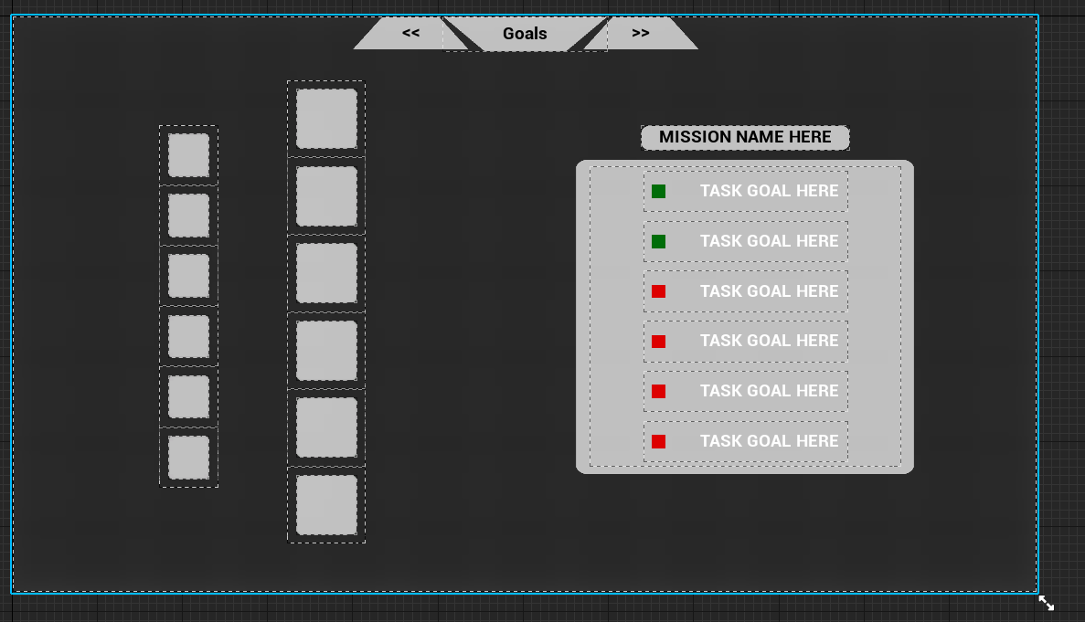
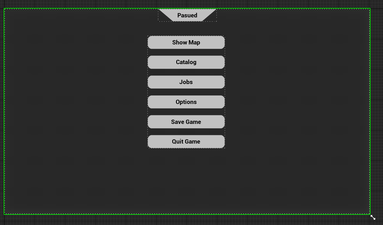
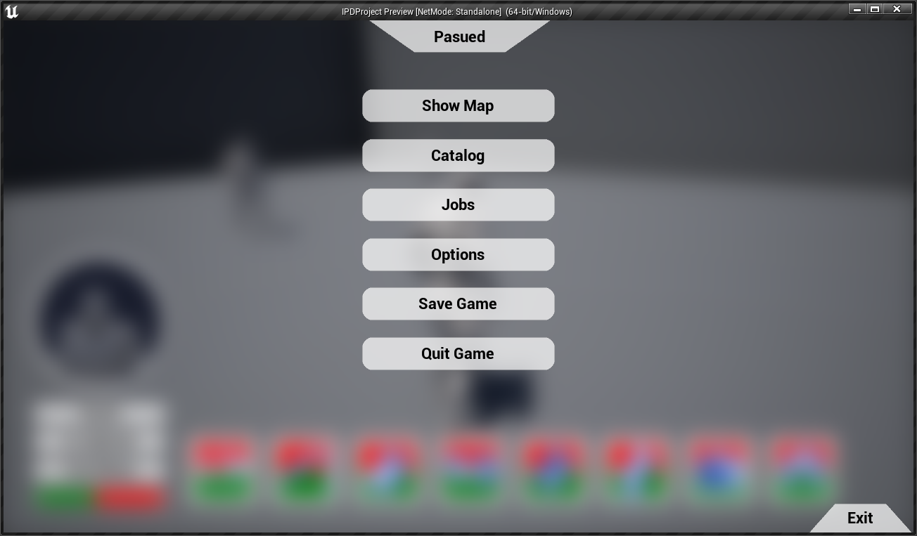
After getting concepts I liked I started to block them out in engine. As I am quite familiar with the UMG Widget editor in Unreal I got these done quite quickly. Figuring out the different grouping boxes like Vertical and Horizontal boxes however once I figured out their own quirks and rules I got the hang of it quite quickly.
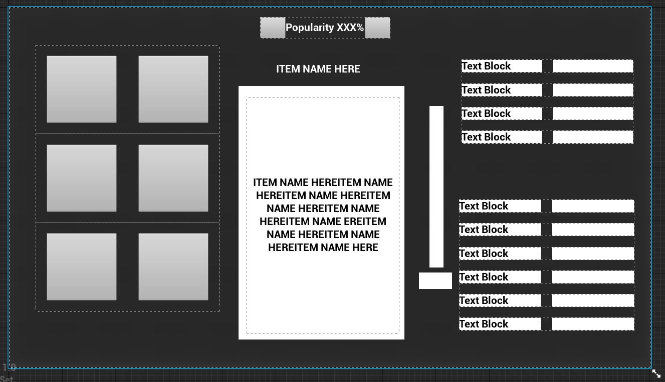
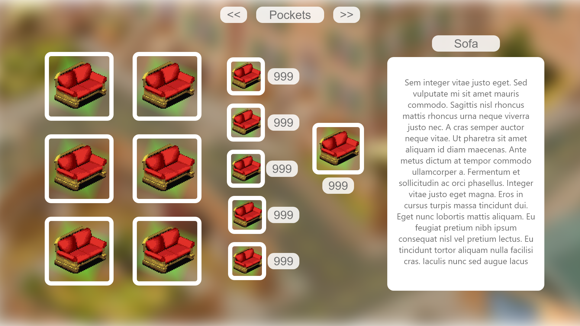
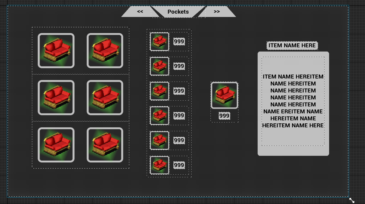
After getting them into Unreal I wanted to work on some of the art assets so the redesign could come to life. Now being a designer I am not the best in art however I tried my best to make something I could then hand over to an artist to create the final assets. Took me a while to get right however I ended up with a result I really liked. These did change more throughout development as I needed to add or change different assets.
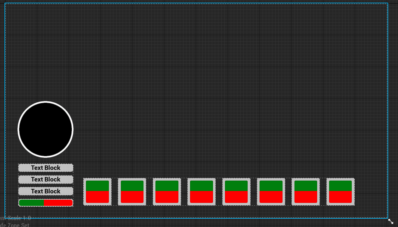
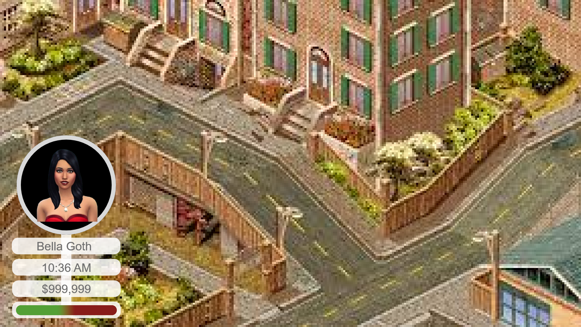
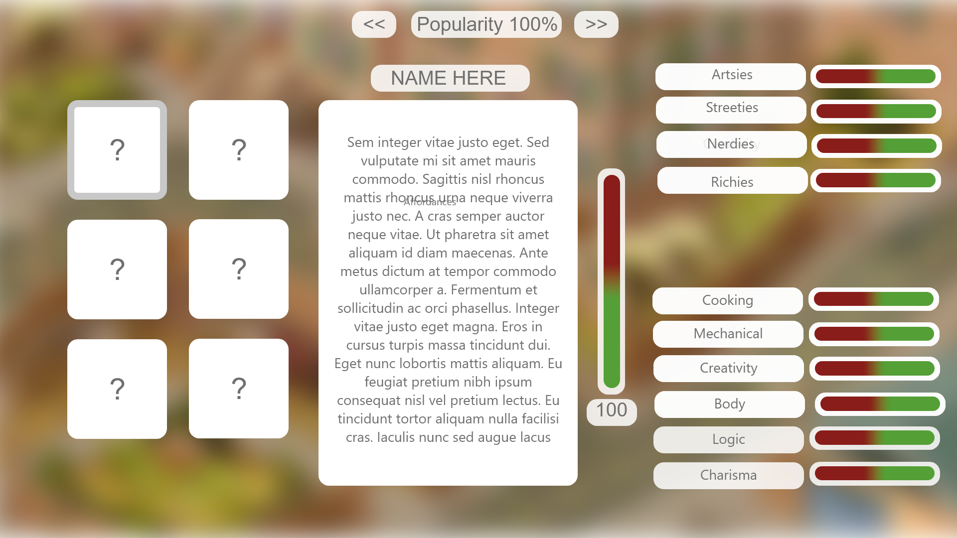
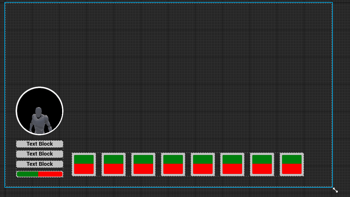
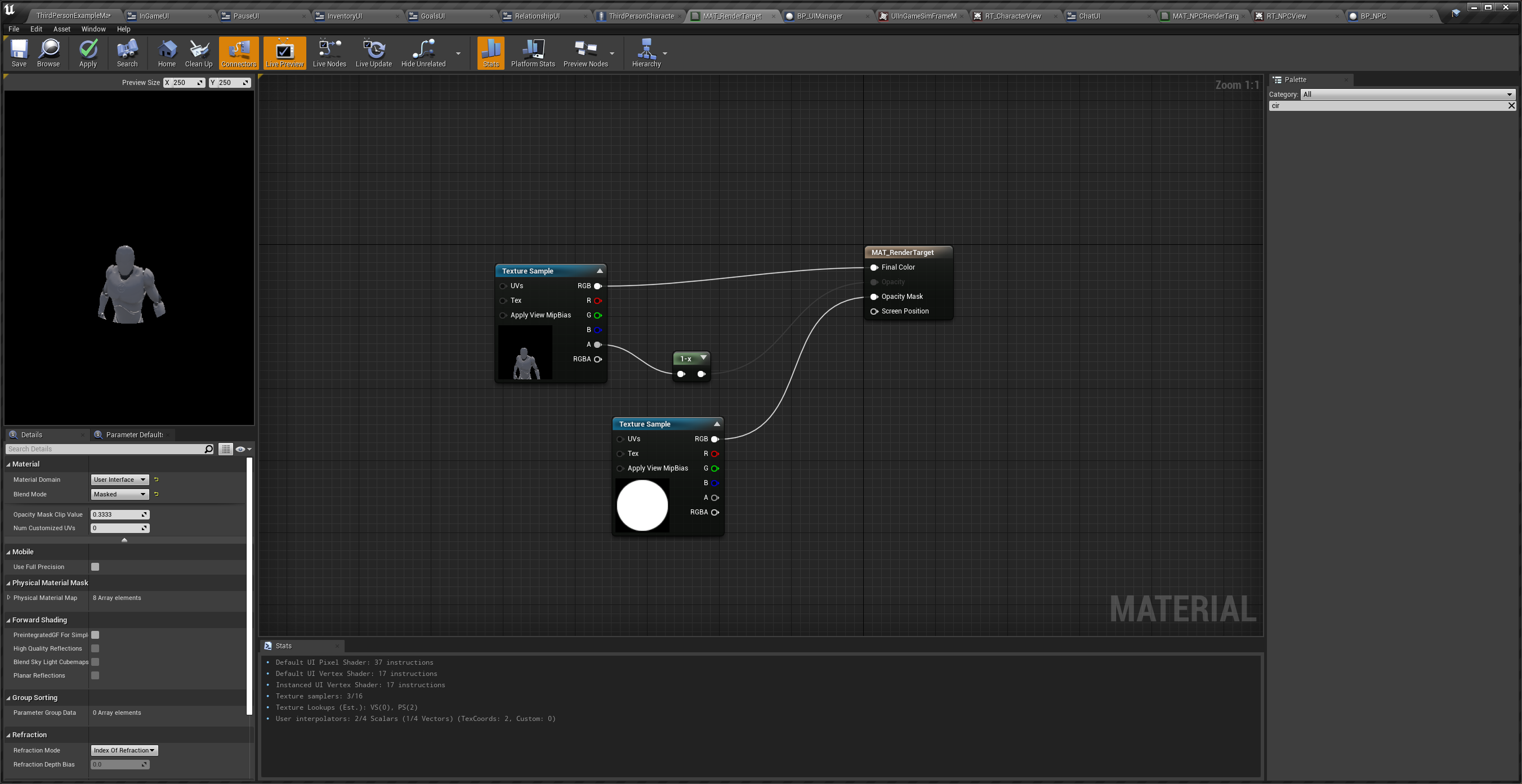
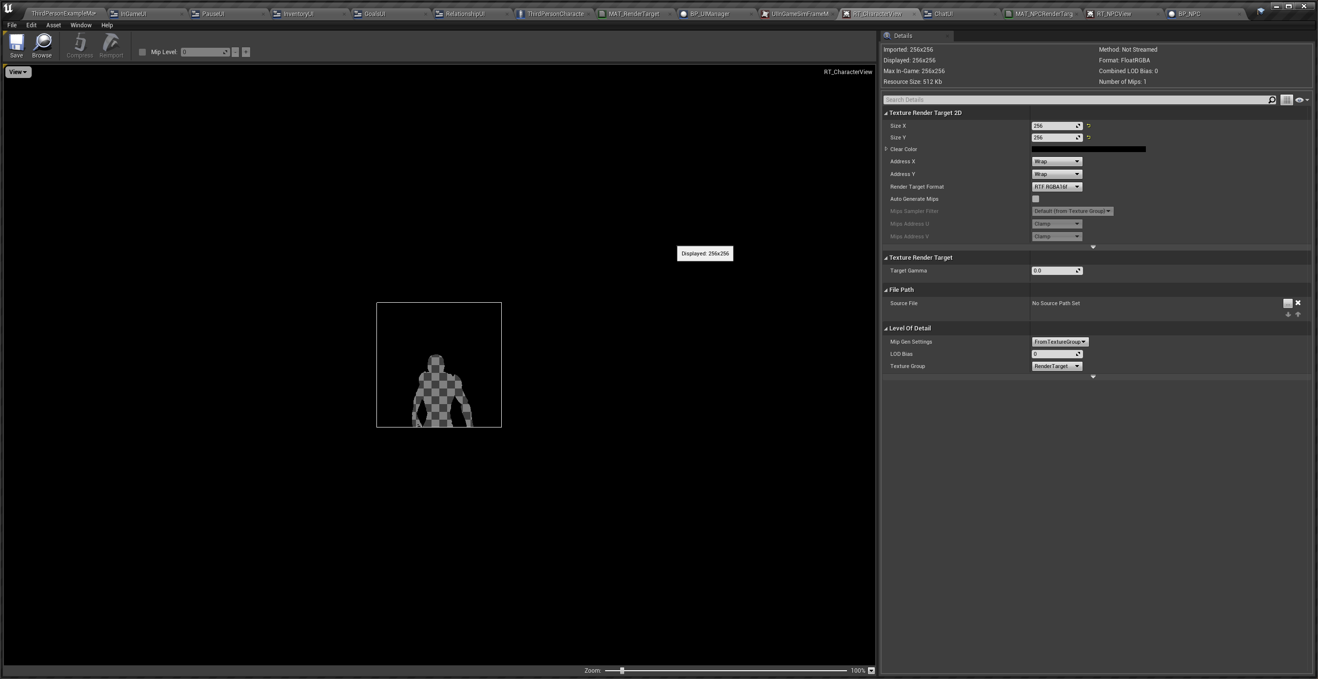
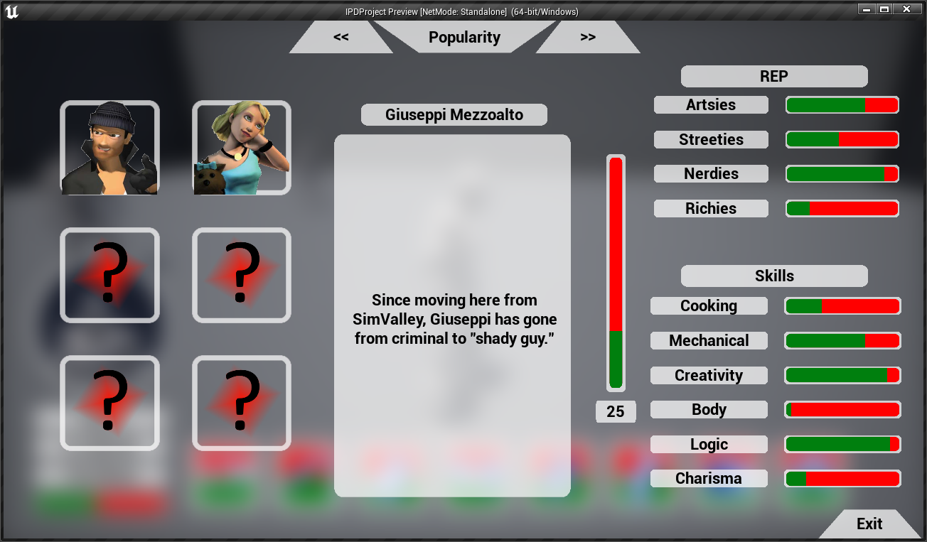
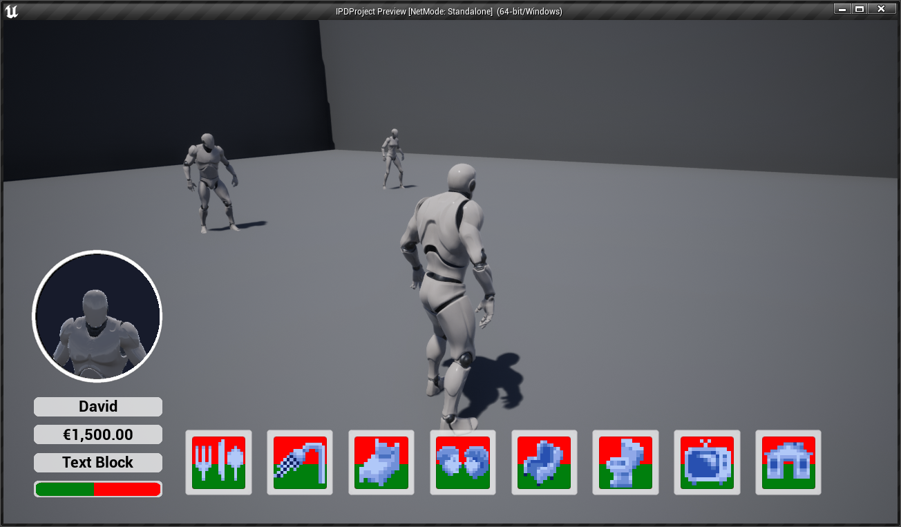
Next biggest thing to do was figuring out the player icon in the bottom left. This was important to me as I wanted to have the portrait of the player to have more life. As in the original game you spend so much time creating this Sim/URB with their own personally to never see them up close again. I knew I would have to use something like render textures. I have used these before in Unity so I knew it would be possible however I needed to make sure I got it right and learnt how to do it. The way i learnt was actually this video by “CodeLikeMe” and this video by “EPICA”. These helped me alot to get very close to the result I wanted. However I still had to figure out how to mask it to fit in the frame I have made. I could not find much help online so I started poking around in the Material Settings for the render Texture and found out how to apply a mask. So using a White/Black mask I was able to make sure the render texture would only render to a circle so I could fit it in my UI element. I also figured out how to use the ShowOnly List by looking at the unreal documentation and trying a few things out. So NPCs wouldn’t show up in the player view UI if you got too close. As I developed the rest of the project I tweaked the camera and other settings to get what you see in the final result.
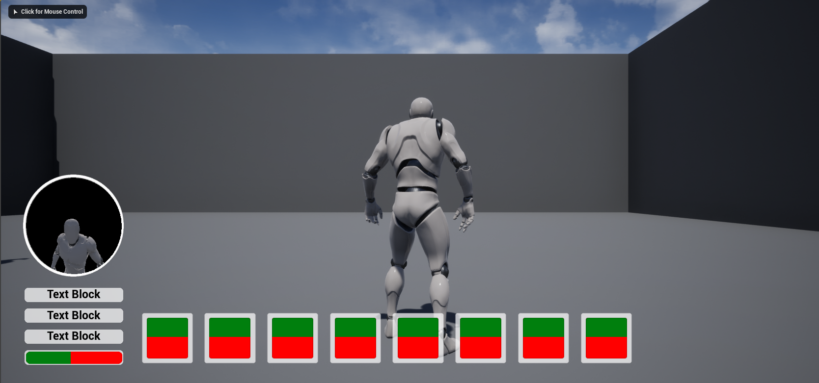
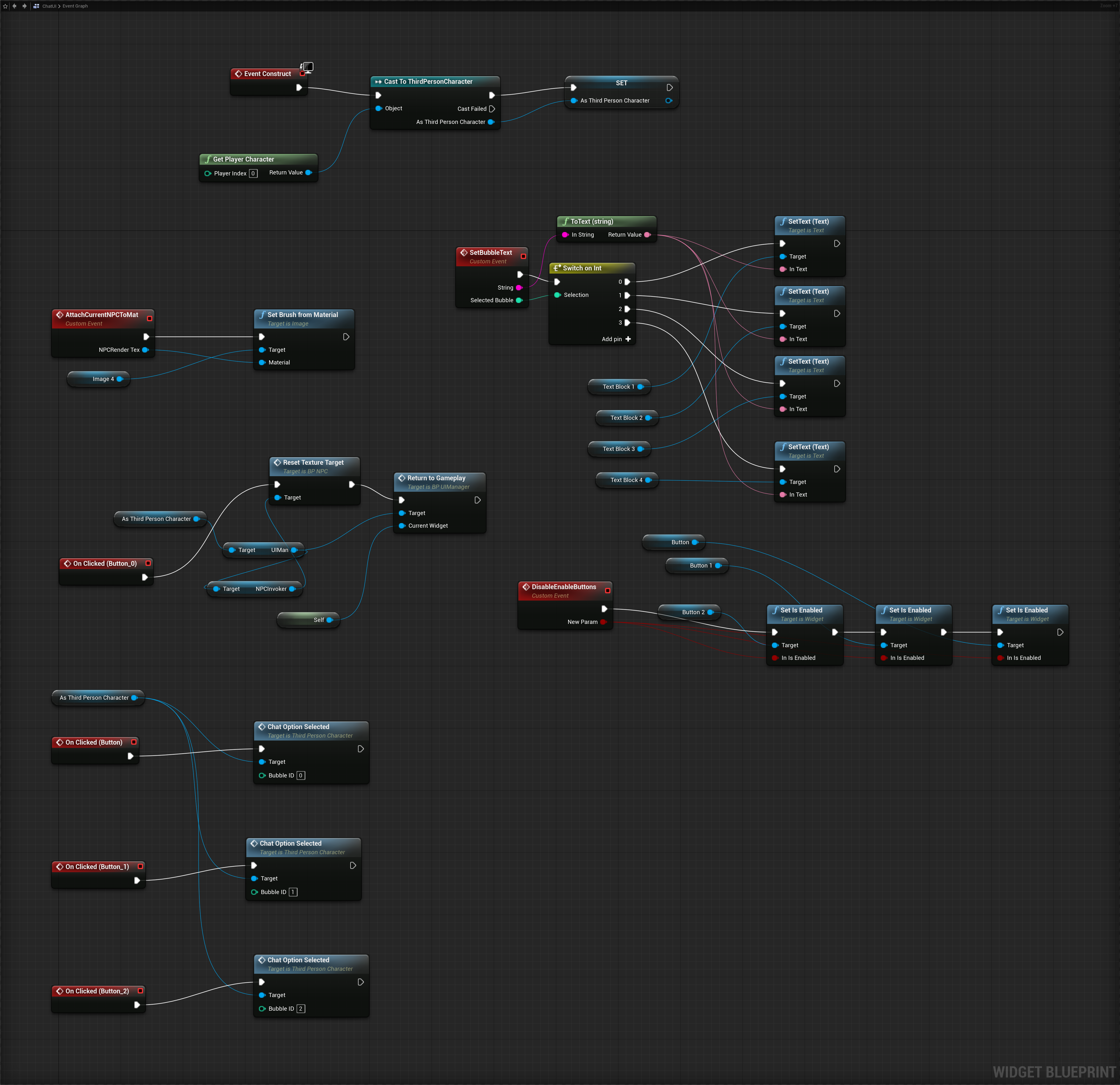
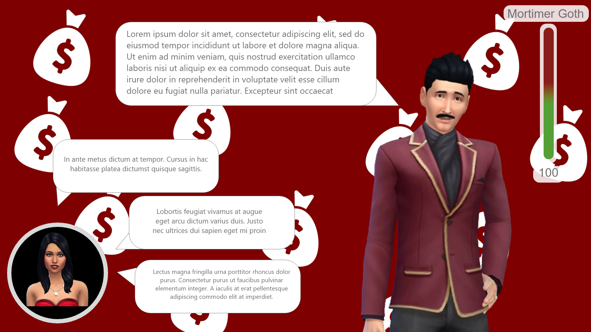
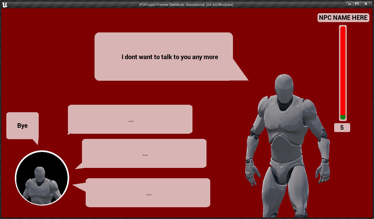
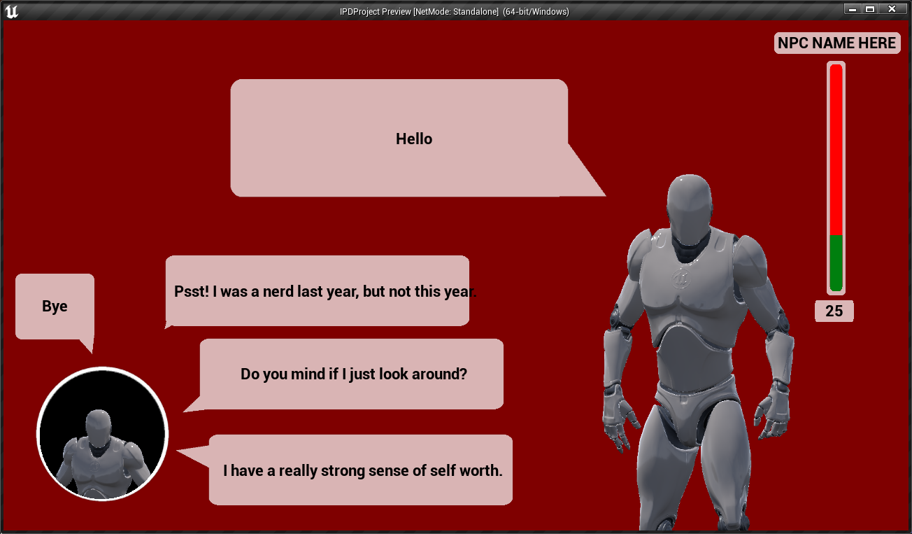
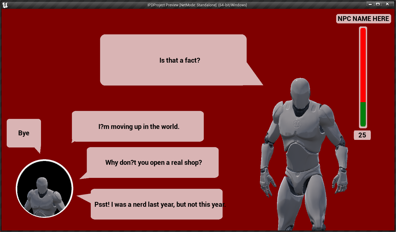
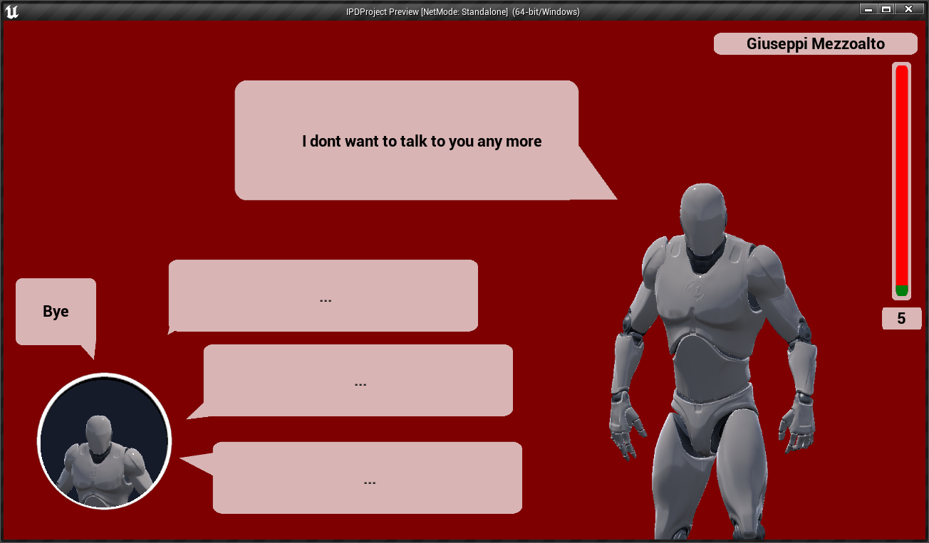
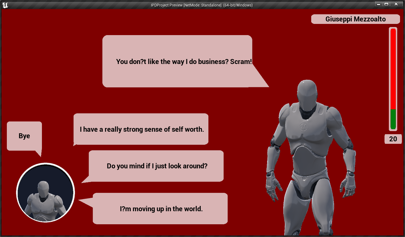
Next I worked on developing the new Chat UI/system. I decided to develop a small dialogue system to really show how the new UI would work. First However I got the UI sorted. Like with the InGame HUD I used render textures to set up the NPC on the right side. If this were made into a full game this would allow you to see animations and their reactions live kind of like the stills from the original games. This would bring the NPCs to life adding full animations instead of stills. Because I had already figured out the render texture stuff this was easier to figure out as I just had to modify what I did before to fit this system.
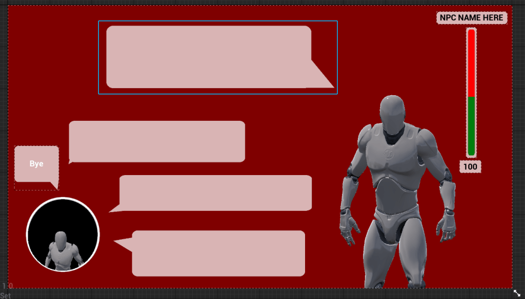
Continuing on the Chat UI I ended up developing a mini dialogue system to work similar to how the original game does it. Its not as deep or involved as the original however it shows off the ChatUI well and how it could function was this a full game and not a UI Redesign. Doing this was also worth it for my learning as I figured out how to use Data Tables and Structures which was something I had no knowledge about before. This will help in future projects where I need to store and import alot of information. This made this system way more modular as well because all you have to do is add more NPC dialogue files into the game and you would easily have more character without much actual development time.


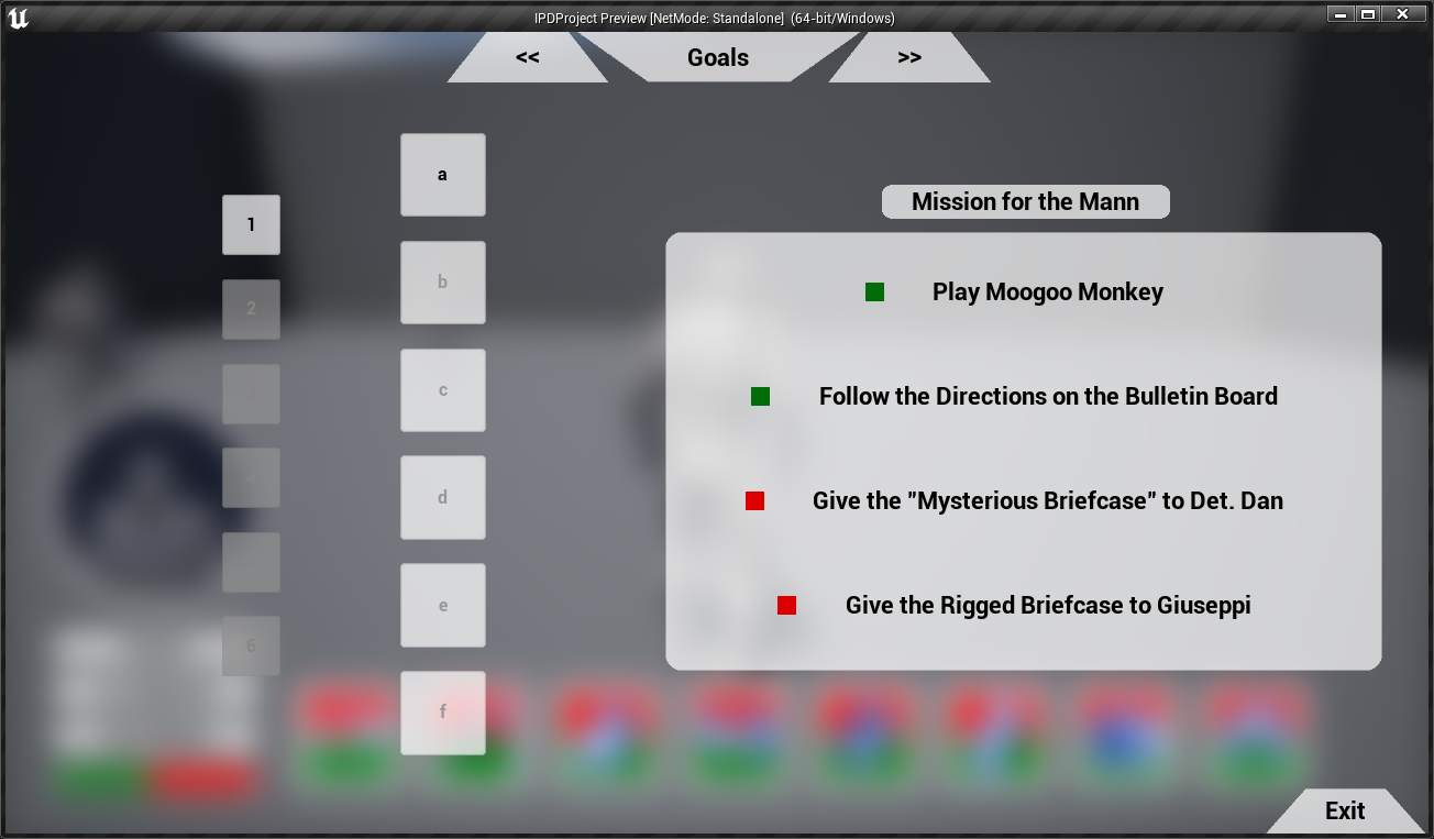
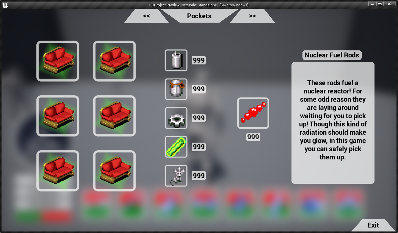
After the Chat System was at a point where I was happy with it. I went back and made final changes to the whole UI as a whole. Adding icons. Changing generic text and general polish. For some of the inventory and skill stats I took the icons straight from the original two games. This was to show how I wanted original aspects of the game to be present while bringing the UI to a more modern design.
Overall I am happy with how this little project went. It helped my general technical skills as well and my UI skills develop. I have came out of this project knowing more about the unreal engine as well as blueprinting in general. I feel like I capture the direction the UI feel would go if they remade the game today for modern systems and feel like I captured that quite well. Below I will show Final Screenshots of the project. If I had more time I would of loved to look into creating some UI animations to show what type of things could of been done to make transitions feel better. However I didn’t make this a priority as I needed to focus on the redesign of the UI and Chat System.


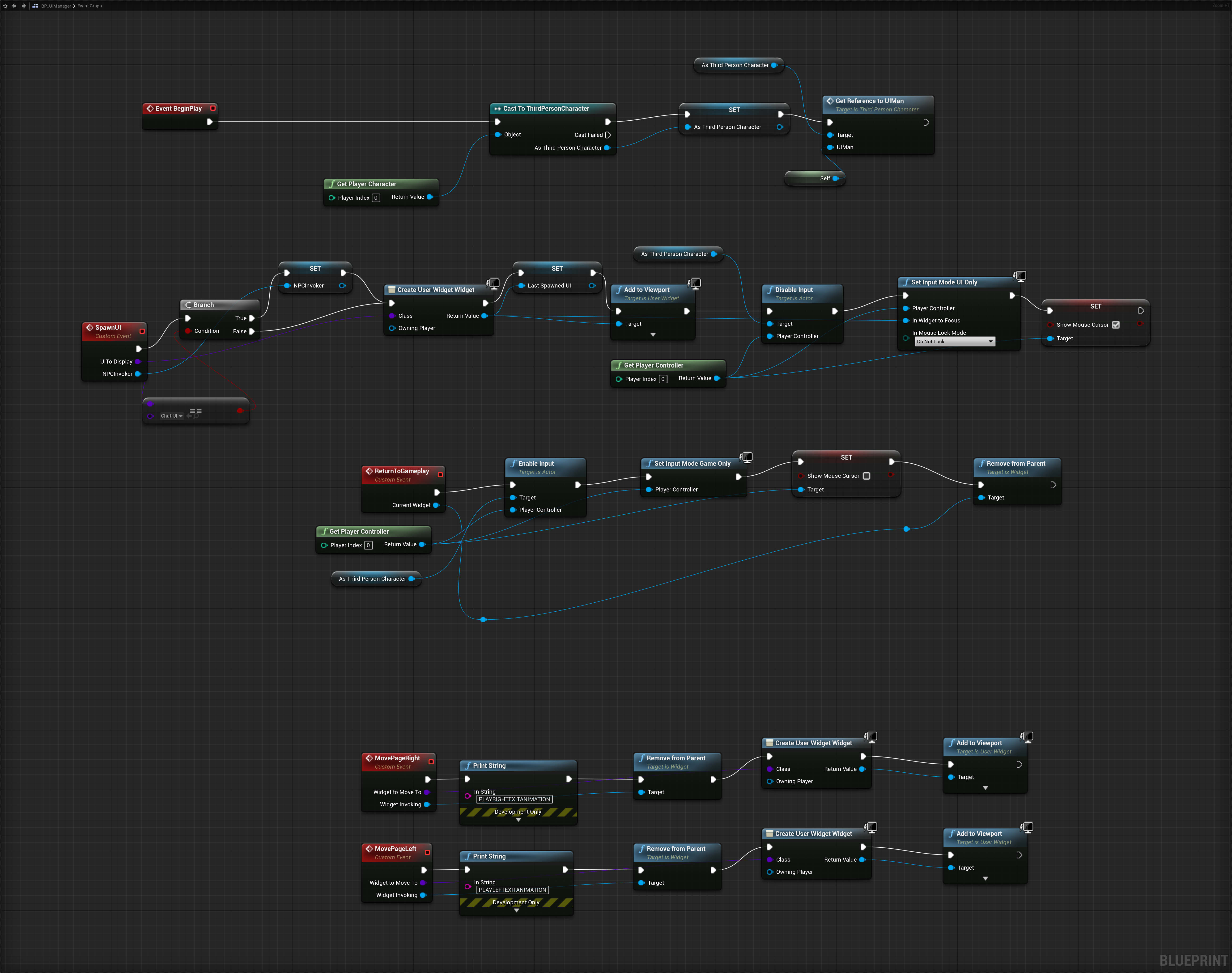
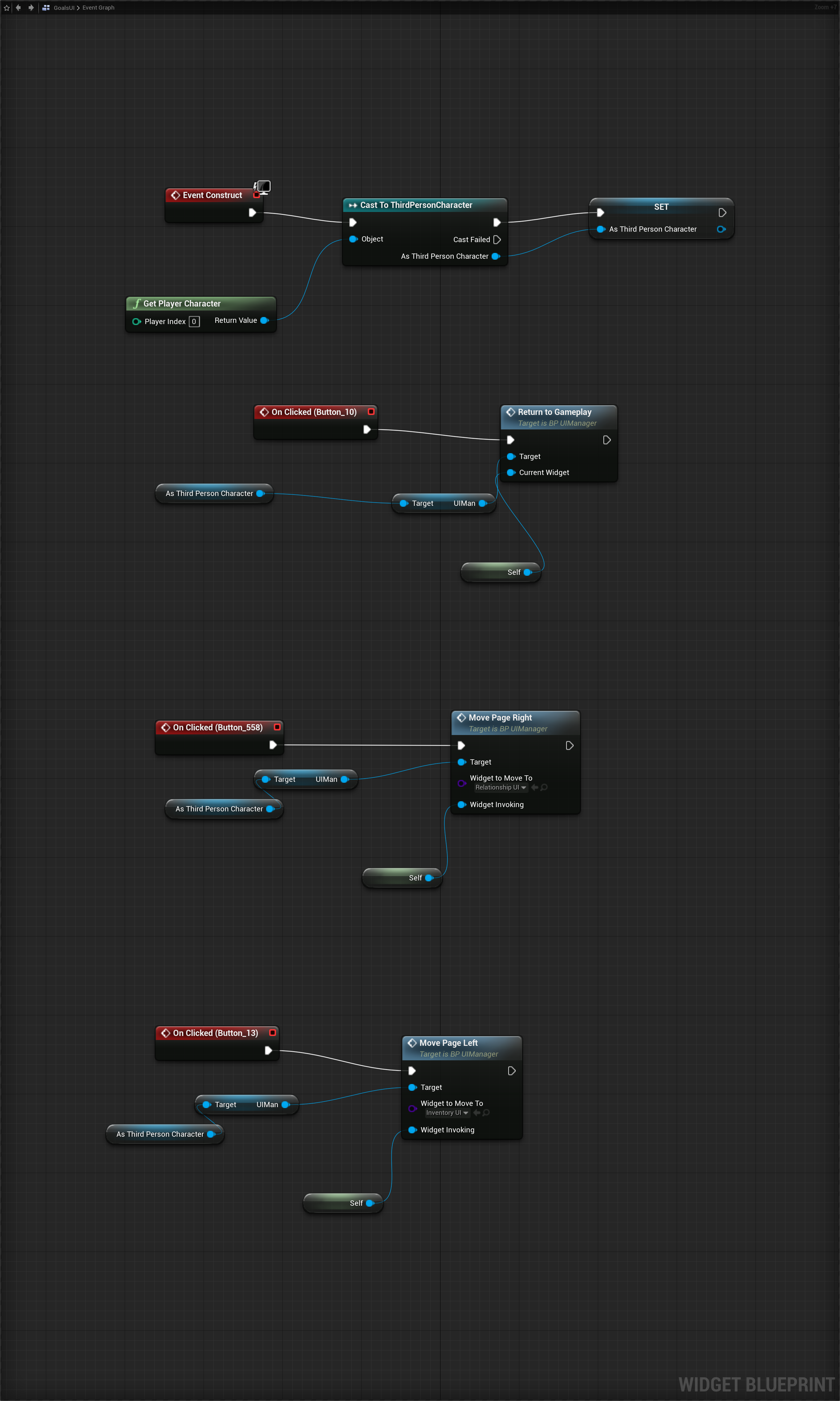
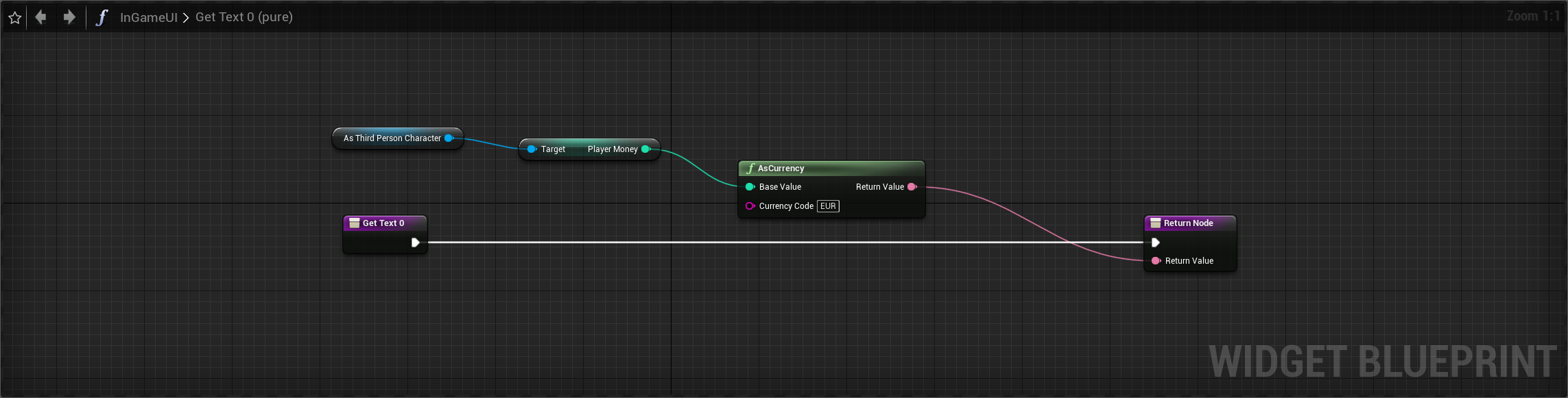
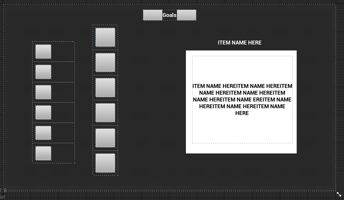
As an extra here are some of the blueprints I developed. They are a little messy however it shows the type of systems I made to make this work.